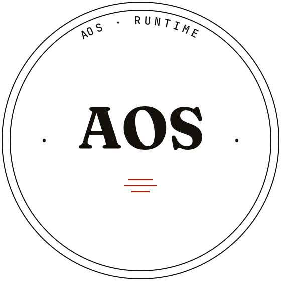
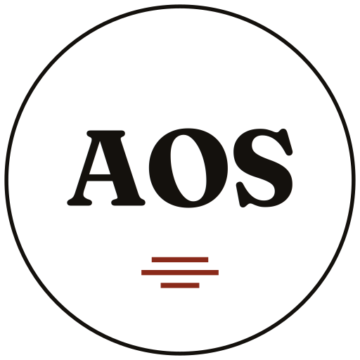
Three scales, one identity.
The seal exists at three production scales. Each is a distinct file with appropriate detail for its display context — orbital text and hairline borders at hero size give way to a solid border at app size, and to a single-letter mark at favicon size.
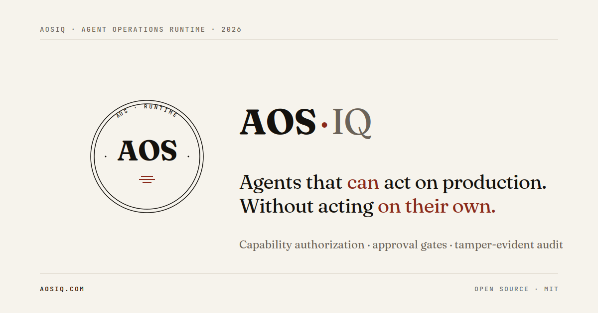
Variant A · weight contrast.
AOS in Fraunces semibold ink. Separator dot in burnt-brick accent. IQ in Fraunces regular at ink-fade. The weight contrast creates hierarchy without losing the unified mark.
Breathing room around the marks.
Both marks need clear space — surrounding area free of competing elements. The minimum clear space is equal to the height of the letter A in the wordmark, applied on all four sides. Don't crowd the marks.
Restrained. Editorial. One accent.
Eight values across paper, ink, and accent families. The single strong accent — burnt brick — is used sparingly: emphasis in typography, the chain rules in the seal, contrast in editorial moments. Never as a flood color.
Three families. Each with a job.
Fraunces carries display and body. JetBrains Mono accents technical moments — labels, code, version numbers, orbital text. Inter Tight handles UI chrome where editorial weight would feel out of place. Don't introduce additional faces.
Do and don't.
The marks survive most contexts when placed with care. A short list of things to do and things to avoid.
- Use the seal as primary identity in document headers, slide cover pages, and signage.
- Use the wordmark alone in inline mention, footers, and footer attribution.
- Place either mark on paper or ink backgrounds — both are designed for both surfaces.
- Maintain minimum clear space equal to the height of the letter A.
- Use the accent color sparingly — emphasis only, never flood color.
- Use SVG vector files for screen and print at any size; favor PNGs only for legacy contexts.
- Don't recolor the marks. Black-on-paper or paper-on-ink only.
- Don't distort, rotate, or skew the seal or wordmark.
- Don't add effects — no shadows, gradients, glows, or 3D treatments.
- Don't place the mark on busy or photographic backgrounds.
- Don't mix the seal with another logo in close proximity. Use the lockup pattern instead.
- Don't recreate the marks from scratch. Use the production files below.
Production files.
Direct links to the production assets. SVG is canonical for vector contexts; PNG is for legacy or fixed-size raster contexts. For partner co-marketing or media references, request a complete asset bundle via hello@aosiq.com.